Data visualisation and colormaps
14 February 2021
Python, matplotlib, Julia
Dataviz
In this post we will talk about a hot topics: the colormaps (or color palettes) used for data visualisation.
Let’s be honest: while I think it is a relevant topic, I also believe it becomes a hype these days. Let’s go!
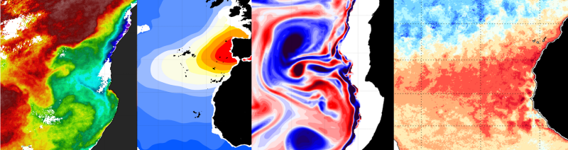
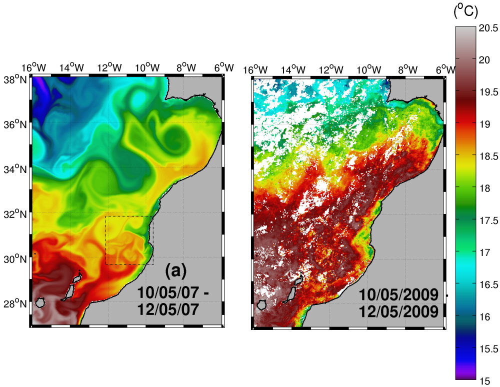
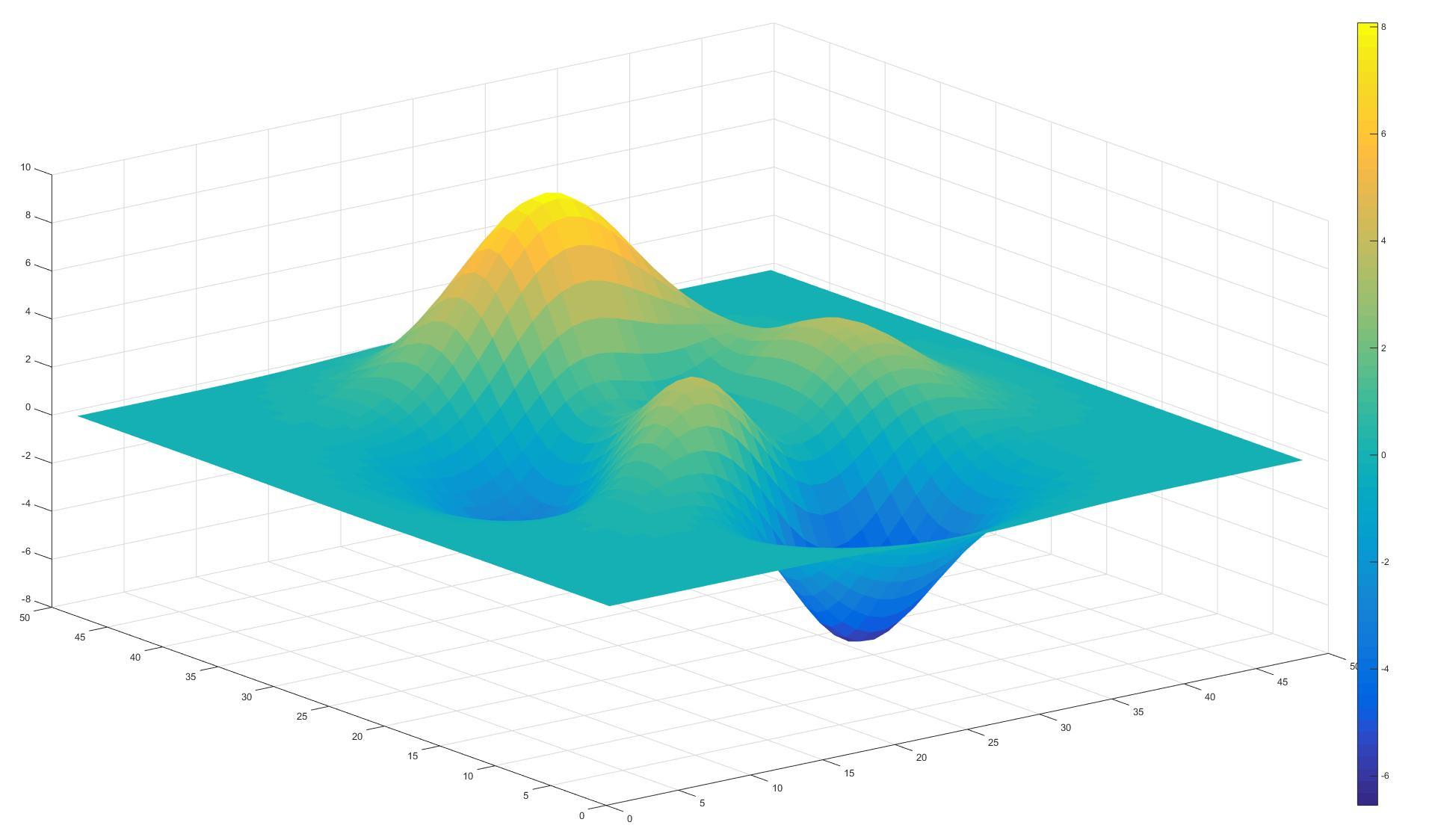
A type of plot that is used a lot, including in geosciences, it the pseudo-color plot (pcolor): each cell is ‘painted’ in a color according to the value of a property: temperature, humidity, wind speed…
In the beginning…
2006 When I started working in #oceanography, everybody was using the famous “jet” or “rainbow” colormaps (I know they are not strictly the same, but no time/interest to discuss that).
2007 already, a paper entitled “Rainbow Color Map (Still) Considered Harmful” was published. Yes, 2007!

And in the references of this paper, we can find, among others, a paper from 1998: “Data visualization: the end of the rainbow”.
So yes, 2 decades ago, we were already trying to kill this colormap.

More of the same
During my PhD I was using a lot the excellent ncview, and a friend of mine had a version “with new colormaps”!! So we were feeling like the bosses with these new superpowers. Nice colormaps, yes, but still no idea about what we were doing.
2013, starting to lean Python, I read more about data visualisation, at that time there was already a lot about colormap, for instance:
On a side note: with the increasing number of available colormaps, we were never totally happy with our choice for the sea surface temperature: jet/rainbow created fake gradients, but other were too… smooth.
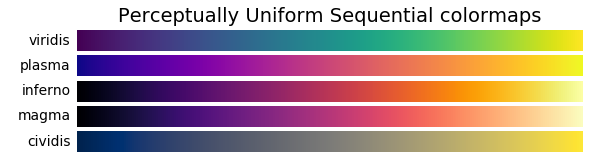
Choosing Colormaps in Matplotlib
2014 At that time I was not using MATLAB a lot anymore, but I remember that they changed their default colormap. That was a big move ;)
2016 another paper about colormaps, this time focused on the ocean: True colors of oceanography For sure they are beautiful, and that could have been the end of the story…
More colormaps were created:
- Colorcet (which I’ve discovered when I wrote this post)
- Holoviews
- Seaborn
- yt
- CMasher: scientific colormaps for making accessible, informative and cmashing plots.
Publications
Let’s go back to publications:
2018: “Geodynamic Diagnostics, Scientific Visualisation and StagLab 3.0.” by F. Crameri in Geoscientific Model Development
2019: “The Importance of Colormaps” by K. M. Thyng in Computing in Science & Engineering
2020: “The misuse of colour in science communication” by F. Crameri in Nature
Conclusions

For more than 20 years, scientists have come up with new colormaps, with the idea of removing the possible distortion or problems. The message was often “let’s get rid of rainbow”. But, if you attend conferences, it’s still alive (which is maybe not so bad)!
Now I’m wondering: is there a time when we will stop producing new colormaps? Isn’t there enough? I believe that the answer is no: if papers are still published on the topic, this creates a demand, so why scientists should stop working on that?