Converting a powerpoint template to LaTeX beamer
19 March 2020
LaTeX, beamer, pdftk
Presentations, templates
Typical situation when you are in a company or work in international projects: you have to use a powerpoint template for your presentations. But what happens if you are more kind of a LaTeX person? This is what we want to explain here.
- When the template is not very well designed: you just forget to use it and hope that nobody will notice during the meeting.
- When the template is nice or when you have a lot of pressure to comply: you might be tempted to do an effort and use it (the template, not powerpoint), i.e., adapt your
LaTeXdocument.
I’ll try to explain how to do that, hopefully speeding up the process to go from a ppt template to a LaTeX beamer template.
Disclaimer: I know that an easier solution would be “just switch to powerpoint (or equivalent)”. There are many reasons one may have to stick to LaTeX, for example if using already existing texts, figures or equations from other documents. Or just because you like it.
0. The target
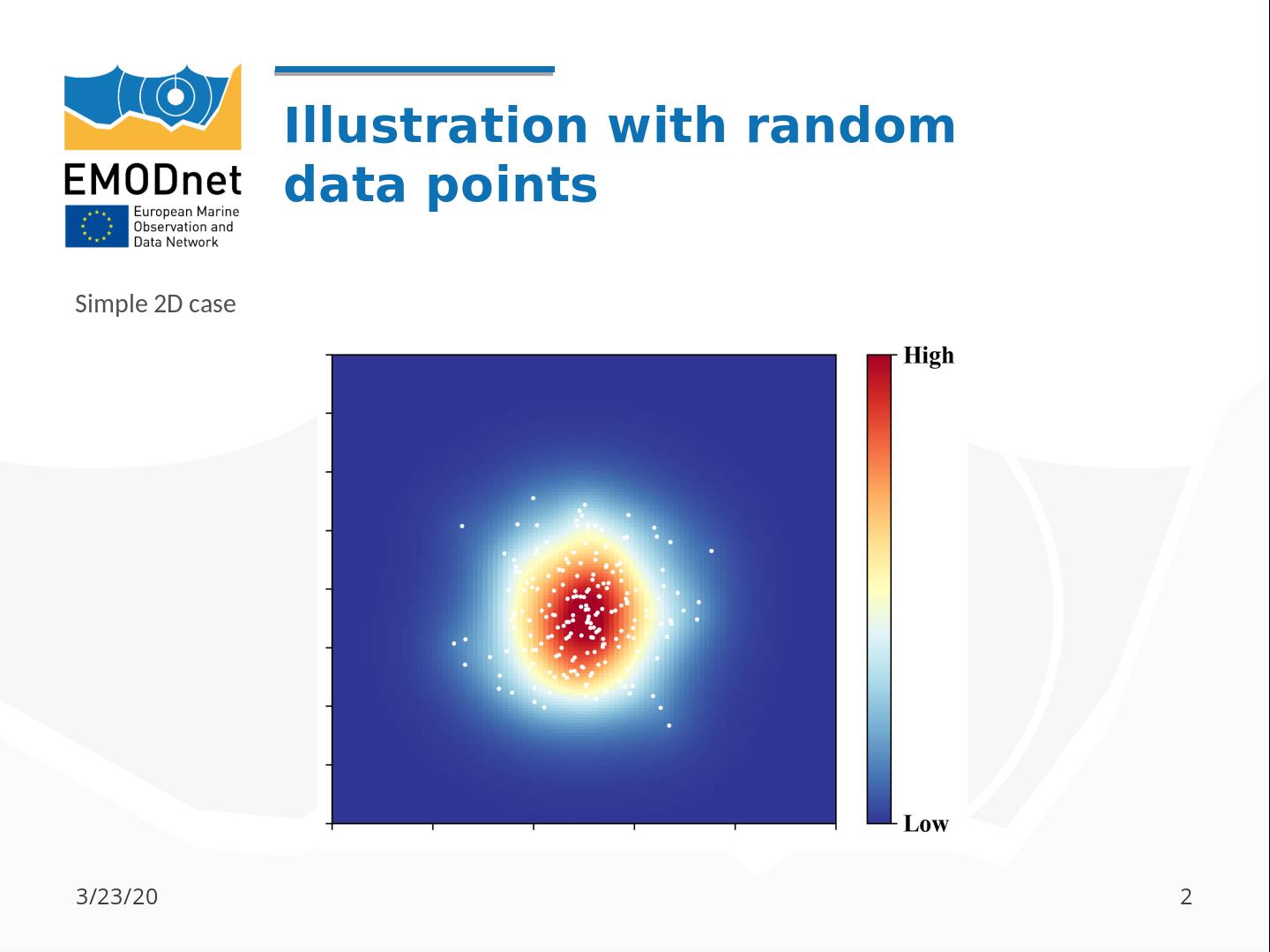
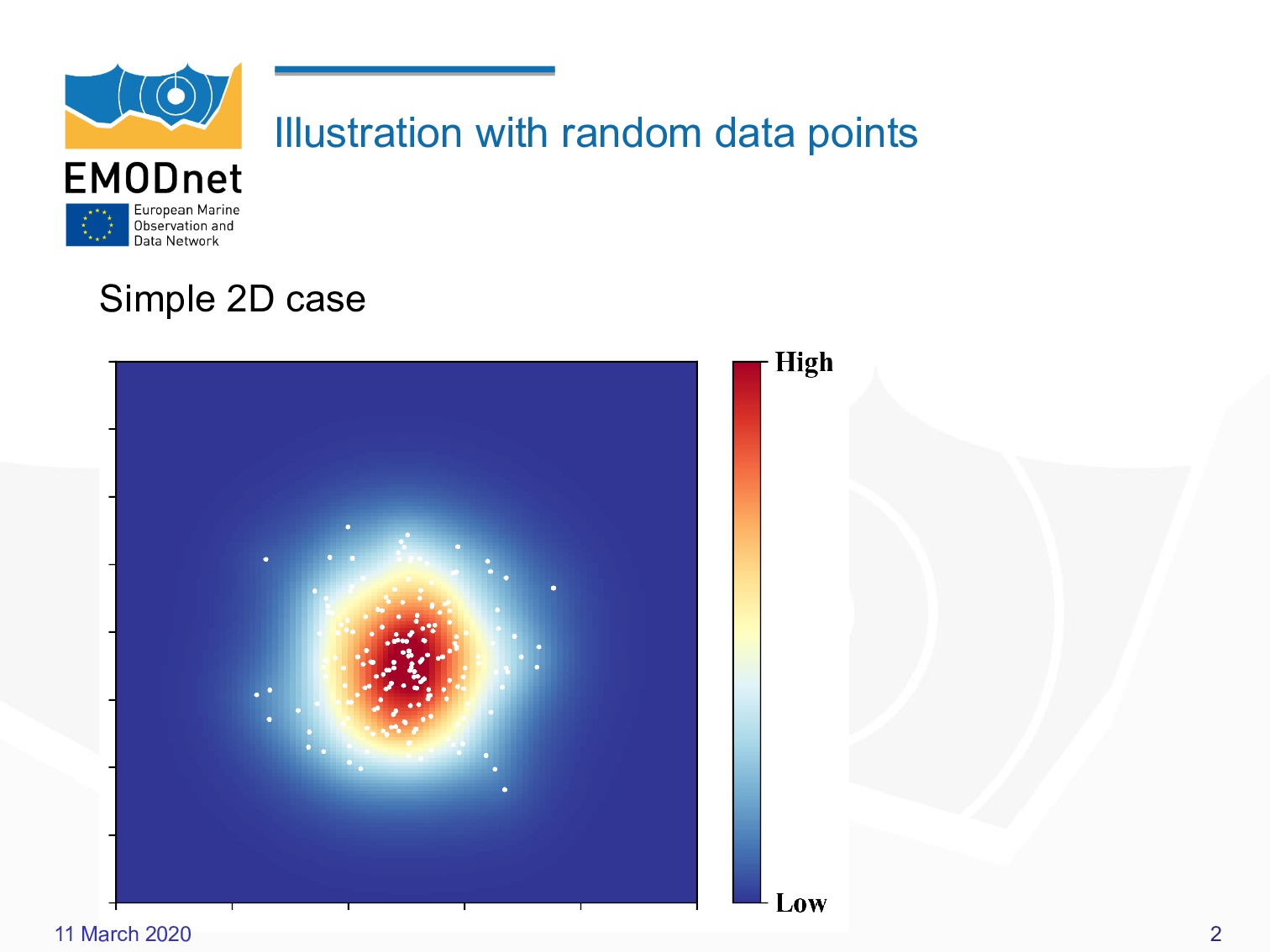
These two images below (title slide and ordinary slide) show what we want to reach at the end.


No too difficult but a few subtleties, such as:
- the authors on a single column (in LaTeX, authors are all defined in
\author{}), - the positions/fonts of title, subtitle and authors,
- position of the slide title (right to the logo).
1. Prepare the slide background
Often the background is rather complex (logos, color gradients, shapes, …), so reproducing all that in pure LaTeX, for instance using TikZ, is feasible but would take too long. So we will proceed differently.
1.1 Convert the template to PDF
First thing not to forget: the template has a distinct background for the title slide and for the other slides. Let’s start with an empty presentation (let’s call it mytemplate.ppt), and then export to PDF file (mytemplate.pdf).
By empty we mean that these is not content (no title, no text… nothing).
You could obviously use a bitmap format (jpg, png, …) instead of a PDF. Try and see what give the best result.
I’ve tried the options Lossless compression (instead of jpeg compression) and select a good resolution (300 dpi, 600 dpi) for the reduction of the image resolution, this did not change the quality or size of the resulting PDF.
1.2 Extract the title background and the slide background
From the file mytemplate.pdf, we need to extract the 1st and the 2nd slides.
This is easily done, for example using the tool pdftk.
pdftk mytemplate.pdf cat 1 output background1.pdf
pdftk mytemplate.pdf cat 2 output background2.pdf


Alternative: a simple screen-shot tool can also be a solution to obtain the backgrounds.
- Ubuntu: I use
gnome-screenshot(graphical interface) and sometimesscrot(bash command). - Windows: I don’t remember the name but yeah, there are severals tools to do it.
Trick: also extract the title slide from a real presentation (not empty), so you can use it as a background and see the positions of the different elements (title, date, authors etc) with respect to the original.
1.3 Include the background in the beamer template.
For all the slides (except the title slide), you just have to add the command:
\usebackgroundtemplate{\includegraphics[width=\paperwidth]{background2.pdf}}
before or after the \begin{document}.
For the title slide (we will see later how to format it), we need to have curly brackets around the frame, like this:
{
\usebackgroundtemplate{\includegraphics[width=\paperwidth]{background1.pdf}}
\begin{frame}
...
\end{frame}
}
The { } around the frame environment means that the \usebackgroundtemplate{ } command is only applied for the current slide.
Combining this, a MWE would look like:
\documentclass{beamer}
\usepackage{graphicx}

\begin{document}

{
\usebackgroundtemplate{\includegraphics[width=\paperwidth]{background1.pdf}}
\begin{frame}
...
\end{frame}
}

\usebackgroundtemplate{\includegraphics[width=\paperwidth]{background2.pdf}}

\begin{frame}
...
\end{frame}

\end{document}
If you compile this file with pdflatex or xelatex, you should obtain something
that looks pretty close to the original template.
2. Setting text properties
2.1 Colors
Different text elements (title, authors, slide titles, …) may have different colors.
When it’s only black and white, it is straightforward. If not, you should use a color picker,
for instance gcolor2.
Let’s imagine that the authors have the color #7F7F7F (HTML notation) and the slide titles have
#0D6CAC.
So you define new colors in the preamble of the LaTeX document:
\definecolor{color1}{HTML}{7F7F7F}
\definecolor{color2}{HTML}{0D6CAC}
Then you have to specify the color of all the presentation elements:
\setbeamercolor{title}{fg=white}
\setbeamercolor{author}{fg=color1}
\setbeamercolor{institute}{fg=color1}
\setbeamercolor{frametitle}{fg=color2}
\setbeamercolor{date}{fg=color1}
The fg means foreground, as it is also possible the background using the bg option.
2.2 Font type
LaTeX default font (Computer Modern) is not always the best choice and is often the first thing that makes someone think “this has been prepared with LaTex”. We first have to identify the font(s) used in the ppt.
| Element | Font name | Weight | Size |
|---|---|---|---|
| Author | Open Sans | Regular | 18 |
| Title | Arial | Bold | 28 |
| Subtitle | Open Sans | Regular | 15 |
| Text | Arial | Regular | 28 |
| Frame title | Arial | Bold | 30 |
We have to use two new fonts: Arial and Open Sans. XeLaTeX allows you to use True Type (TTF) and Open Type fonts (OTF).
Anytime you have to play with fonts, a good resource is the LaTeX font catalog: there
you can find a long list of fonts and the commands to use them in your document.
Arial is a commercial font: if it is available on your machine, you can use:
\usepackage{fontspec}
\usefonttheme{serif}
\setmainfont{Arial}
The command \usefonttheme{serif} is necessary because beamer use serif font by default.
If it is not installed, you can find an equivalent using http://www.identifont.com. According to them, the closest font is Helvetica, which has also to be purchased. Another possibility (after searching a little bit) is TeX Gyre Heros (see fontsquirrel), which is added with:
\setsansfont{TeX Gyre Heros}
Open Sans is a sans serif typeface belonging to the google fonts. There are several ways to use it, here we show how
to specify the file containing the font (.ttf or .otf extension). We create a new font family that we will call, for instance \myfont
\newfontfamily\myfont[Path = /home/ctroupin/.fonts/]{OpenSans-Regular.ttf}
Then this font is assigned to the beamer elements:
\setbeamerfont{author}{size=\fontsize{10pt}{10}\selectfont,series=\opensansfont}
\setbeamerfont{subtitle}{size=\fontsize{8pt}{10}\selectfont,series=\opensansfont}
2.3 Font size
Slide elements
Each element of a presentation can be assigned a different size, for example with the title:
\setbeamerfont{title}{size=\huge}
Here we know the font size in pts (see the Table of Section 2.2), hence it is easier to directly specify these numbers in the command:
\setbeamerfont{title}{size=\fontsize{28pt}{10}\selectfont}
The second argument of \fontsize{}{} is the baselineskip value.
However this just does not work: in Beamer, using 28pt for the title is way too big, and bigger than
what we had the original ppt.
Solution?
- Try different values, until we have something similar to the title in ppt,
- then for the other elements, we just conserve the ratios.
Yes I know: not very clever, and there is certainly a way to properly compute the correct font sizes.
Here we end up with
\setbeamerfont{title}{size=\fontsize{14pt}{10}\selectfont}
\setbeamerfont{author}{size=\fontsize{10pt}{10}\selectfont}
\setbeamerfont{subtitle}{size=\fontsize{8pt}{10}\selectfont}
\setbeamerfont{frametitle}{size=\fontsize{12pt}{10}\selectfont}
\setbeamerfont{date}{size=\fontsize{8pt}{10}\selectfont}
Slide text
Now to set the size of the main text (i.e., the slide content), it can be done with the first line of the document:
\documentclass[14pt]{beamer}
Note: the value 20pt seems the largest you can set: if you try with, for instance 28pt, the text will end up
in the default value (11pt). Here we set it again to half the value obtained from the ppt.
2.4 Font weight
Decide if the text has to be normal, bold etc. According to the template, both the title and the frame titles should be in bold. We could do that using the series=\bfseries option:
\setbeamerfont{title}{size=\fontsize{14pt}{10}\selectfont,series=\bfseries}
\setbeamerfont{frametitle}{size=\fontsize{15pt}{10}\selectfont,series=\bfseries}
However, again comparing with the ppt template, we see that the results are better without that option.
3. Slide layout
Most of the issues concerning the text has been solved, but still, the result does not look like the original ppt, mainly because the different elements are not well placed in the slides. Let’s fix that.
3.1 Frame title
By default it appears in the top-left corner. It may require some adaptations according to the template. One way to that is to add vertical and horizontal spaces before the frame title:
\setbeamertemplate{frametitle}{\vspace*{1cm}\hspace*{1.75cm}\insertframetitle}
The values set here were found by successive tries. Again, it is not a question of millimeters, nobody will notice the difference if your frame title has an horizontal offset.
3.2 Title slide
We kept this part for the end as it can be tedious: all the elements (title, subtitle, date, …) have to be properly placed and defined.
Solution 1: beamer template
We can define the template for the title page with the command:
\defbeamertemplate*{title page}{customized}[1][]
{

}
We will use the commands \inserttitle, \insertdate, \insertauthor, etc for each element. There is also a possibility to include graphics (logo etc). The final command looks like:
\defbeamertemplate*{title page}{customized}[1][]
{
\vspace{3cm}
{\usebeamerfont{title}\usebeamercolor[fg]{title}\inserttitle}
\vspace{.8cm}
{\usebeamerfont{subtitle}\usebeamercolor[fg]{subtitle}\insertsubtitle, } \usebeamerfont{date}\usebeamercolor[fg]{date}\insertdate
\vspace{1.cm}
\hspace*{5.25cm}
\begin{minipage}[c]{2.5cm}
\flushright
{\usebeamerfont{author}\usebeamercolor[fg]{author}\insertauthor}
\end{minipage}\hspace{.15cm}
\begin{minipage}[c]{1cm}
\flushright
\inserttitlegraphic
\end{minipage}
\vfill
}
but it required (too) many tests to figure out the right positions.
Solution 2: TikZ
With TikZ we can easily set the exact positions of each element on a grid. This way is faster than the 1st solution.
To make the process easier, we can overlay a grid on the slide:
{
\usebackgroundtemplate{\includegraphics[width=\paperwidth]{background1.pdf}}
\begin{frame}
\begin{tikzpicture}[remember picture, overlay]
\foreach \x in {0,...,12} \path (current page.south west) +(\x,0.25) node {\small$\x$};
\foreach \y in {0,...,9} \path (current page.south west) +(0.25,\y) node {\small$\y$};
\foreach \x in {0,0.5,...,12.5} \draw (current page.south west) ++(\x,0) -- +(0,9.6);
\foreach \y in {0,0.5,...,9.5} \draw (current page.south west) ++(0,\y) -- +(12.8,0);
\end{tikzpicture}
\end{frame}
}
With the grid coordinates, each element is placed by a command like:
\draw (current page.south west) +(1.4, 5.25) node[anchor=south west] {\usebeamerfont{title}\usebeamercolor[fg]{title}\inserttitle};
which means:
- at a coordinate (1.4, 5.25), computed with respect to the left-bottom corner,
- we add a node with a southwest anchor
- the code contain the title, formated according to its color and font.
There are certainly other ways to do it, but as it works, let’s keep it like this.
4. Final touch
Navigation symbols
By default, beamer puts navigation symbols in the bottom-right of the slide.
To get rid of them:
\setbeamertemplate{navigation symbols}{}
Itemize/list symbols
Sometimes bullet point lists are not created by bullets, but with another symbols (which doesn’t prevent from the death by bullet point): squares, dashes, arrows, … A simple example:
\setbeamertemplate{items}[triangle]
In some cases, the symbol in the list is more complex, it can be image or a small logo:
\defbeamertemplate{itemize item}{image}{\small\includegraphics[height=1.6ex]{myimage.png}}
\setbeamertemplate{itemize item}[image]
Footline
We will add the slide number in the right corner and the date (for example) in the left corner (though it might be necessary in general):
\addtobeamertemplate{navigation symbols}{}{
    \usebeamerfont{footline}%
    \usebeamercolor[fg]{footline}%
    \hspace{1em}%
    \insertframenumber
}
Last fix: we don’t want to have this footline in the title frame. For that there is an plain:
\begin{frame}[plain]
…
\end{frame}
This can also be useful for the last slide of the presentation.
5. The result
It is not perfect but is does not look to bad compared to the initial target.


6. Unsolved issues
Vertical spacing in author list
The authors are defined in a single element (\author{ }) that we place in the title using
a TikZ node in which we set the text width. The vertical spacing is obviously too large compared
to the template.
Fonts…
Even if we take the same fonts as in the ppt (at least according to LibreOffice), the final result is not
exactly the same.
Frametitle
In the template, its width is limited, hence the line break. This can be implemented using for example:
\setbeamertemplate{frametitle}{
\begin{beamercolorbox}[wd=\textwidth, ht=0.5cm, dp=0.2cm]{frametitle}
\usebeamerfont{frametitle}\insertframetitle
\end{beamercolorbox}
}
but that’s not so necessary.
7. Conclusions
They are the same as in other articles I’ve written: is it worth doing all that, instead of either
- use LibreOffice, OpenOffice or Word directly or
- just skip the template and keep your own?
The answer depends on the time at your disposal and the will to make something nice. For example Antonio prepares really excellent tortillas, using the potatoes and eggs from his yard. It takes a while to prepare (and a lot of dishes to wash afterward), much longer than if he had bought it at the supermarket, but the result is so much better when he prepares it.