Fake conferences (#scamference)
29 January 2019
Leaflet, Python, matplotlib
As any scientist (I guess), I was getting bored because of all the invitations to, let’s say, strange conferences. I say strange because of the look of their web page, the topic (no relation with what I’m doing) and the famous keynote speakers, that you never heard of.
During one year I decided to:
- Read those mails, often located in my spam folder (3 seconds per mail).
- Very important: the Unsubscribe button.
- Collect the dates and locations.
The main discovery (but not surprise) is that you often have many conferences of different topics organised extactly at the same place and the same time… suspect, isn’t it?
Disclaimer
I don’t pretend any of those conferences is real or fake. I follow the principle:
They sent me an invitation mail → they appear on the map.
First tries…
The idea was to highlight that feature on a graphic. After many tries, I ended up with that one, which does not convince me:
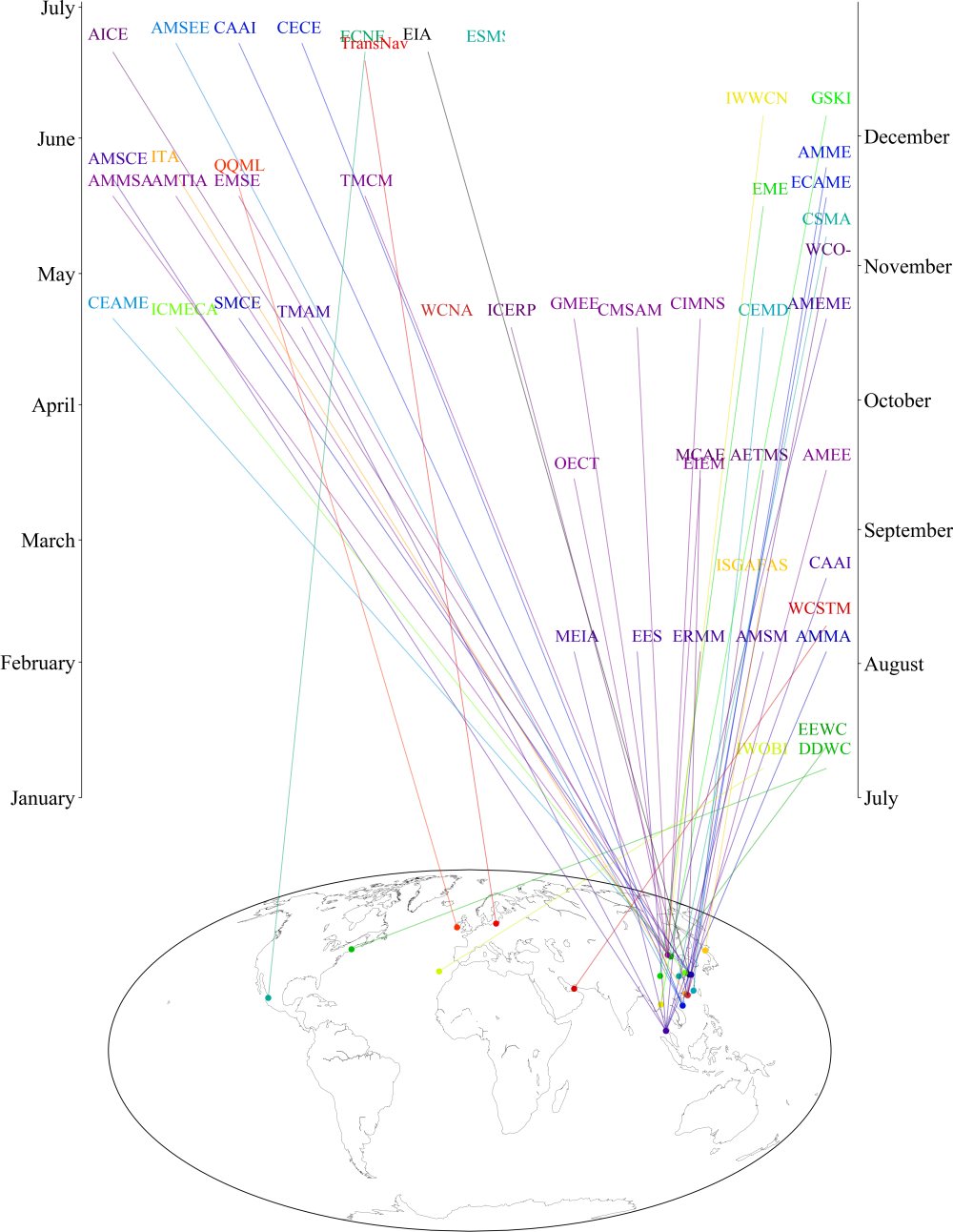
- A map with the location of the conferences.
- 2 vertical time-lines.
- A line between the location and the date, with the conference acronym.
Quite messy, and not conveying any clear message.
Simpler = better
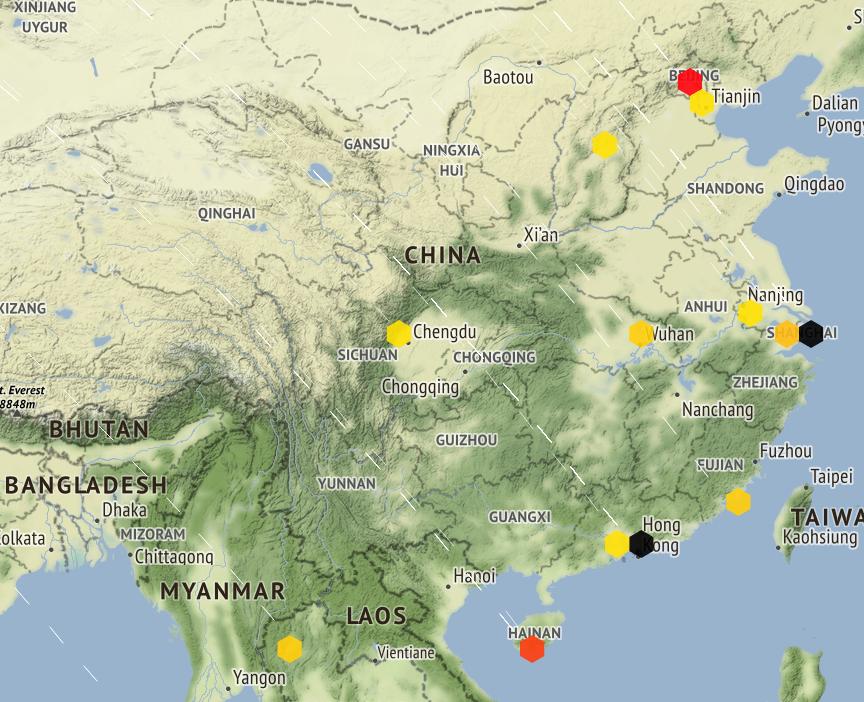
Next try: the conference locations are shown as clusters. No information on time in this version. The screen-shot below is too small to display the numbers but we have more than 60 events organised in China.
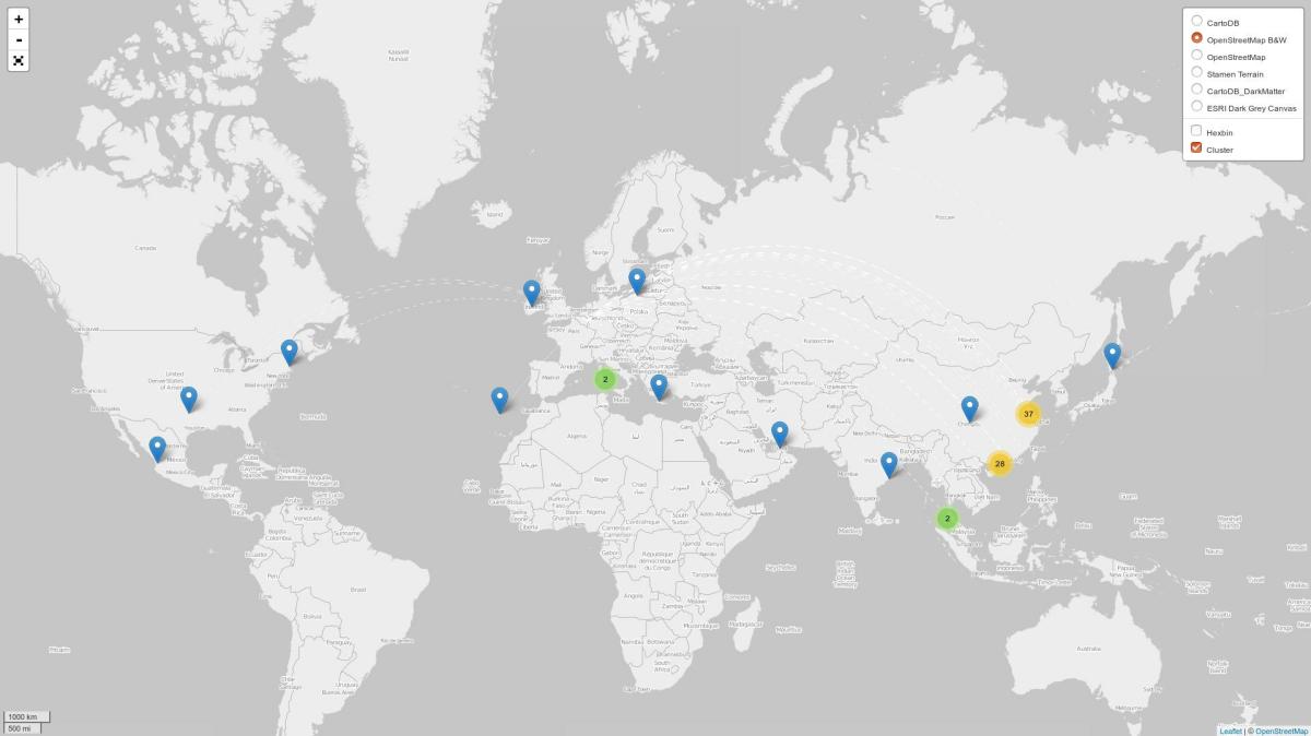
Let’s be clear: not all the conferences shown here are scamferences, but a lot of them fall into that category. Anyway, I just don’t want to try to attend those events to check them, or try to find more info.
Hong-Kong, Shanghai, Beijing… here are some of the hot places to be!
Future work
I’m trying to combine the map with a polar plot to represent the time of the year.
Of course any idea is welcome.