Where are we running?
12 February 2019
Python - matplotlib - GPSbabel - gpxpy
It’s always cool to work on data very close to us, in this case I mean the running tracks around the office. The simple and direct visualisation consists in plotting all the trails on the map and add a heatmap or hexbin layer to see the spatial density.
Here I try to explore other possibilities.
Read the data
First thing first: get the data. GPX is a wide-spread format and gpxpy the perfect tool to read the files. In the past I had my own parsing function using regex but hey, why not using what already exists?
Available data
I have tracks since 2013, though most of the tracks around Sart Tilman are concentrated in 2017-2018. The total is about 150 files.
Processing
The GPX files are slightly edited:
- The extensions tags are removed, as they don’t store information we need.
- The trajectories are sub-sampled to 500 points.
We will compute:
- the distance to a central point, located close to our offices, using the
Vincentydistance function available in thgeopymodule, - the direction with (e.g. northward, southward, eastward, …) with respect to the starting point, using the
bearingfunction from thegeo-pymodule - the altitude, directly read from the file.
The code is not optimised and takes a dozen of seconds to run on all the files.
Figures
Direction histogram
We start with an histogram to display the most frequent zone with respect to the starting point.
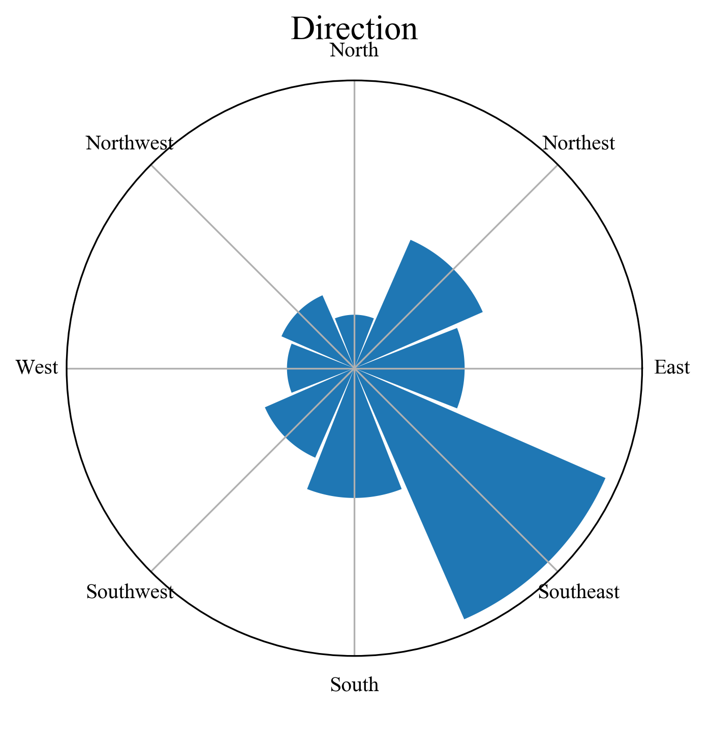
We directly see that we spend more time in the southeast sector, which makes sense knowing that the sport facilities and the track are located there.
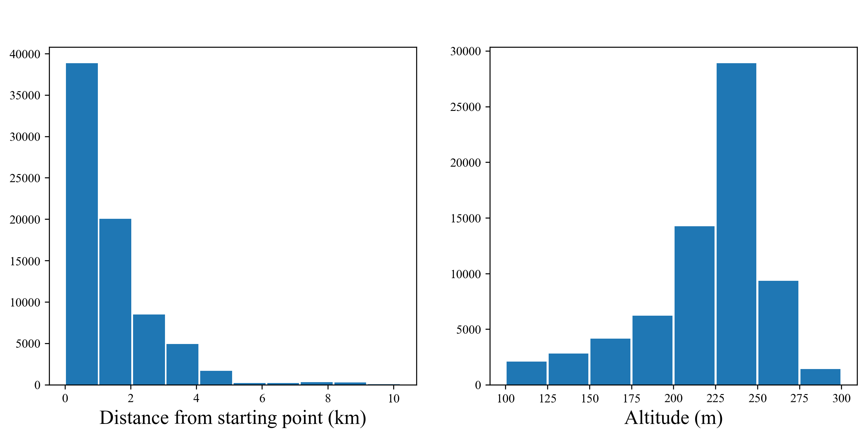
I did not compute anything here but it’s clear from the plot that we stay almost always within 4 km from our starting point. In fact the locations at more than 8 km from Sart Tilman come from a race done in Esneux and training sessions in Liège center, which I might remove from the database.
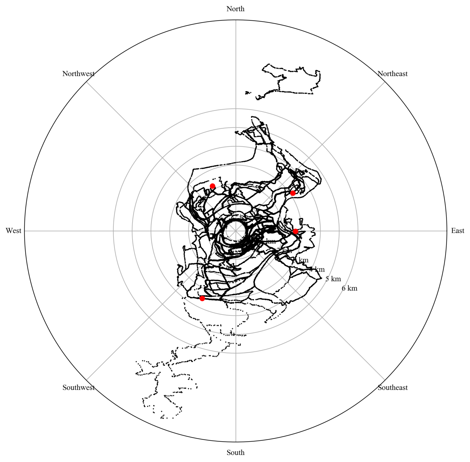
Positions in polar coordinates
In this figure we simply plot the different tracks in the new coordinate system with some points of interest (red dots) that we use to visit, helping me to check if everything is correct.
pointsInterest = [
    [50.552, 5.5502, "Roche aux Faucons"],
    [50.6024, 5.5957, "Lande de Streupas"],
    [50.5818, 5.6027, "Rochers du bout du monde"],
    [50.6007, 5.5554, "Point de vue"],
    ];
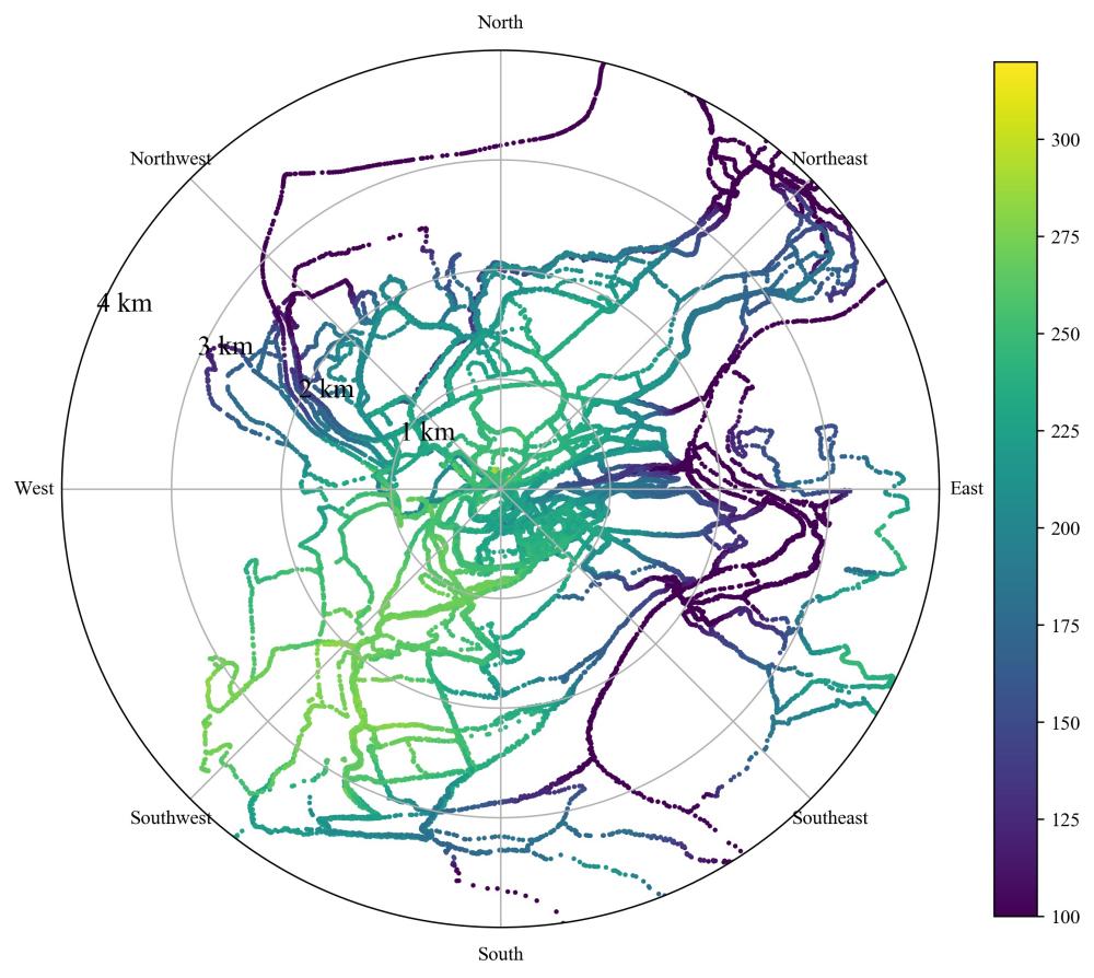
Positions and altitude
Same as the previous one, but now the dots are colored according to the altitude measured by the device. The lowest parts (dark blue) are the valleys of the Meuse and the Ourthe rivers.
Final results: the pseudo-color plot
Final one: the goal is to count count how many times we’ve been in different subregions delimited by angles and distances. I won’t write the whole code here, just the lines that allows us to count quite easily.
r_edges = np.arange(0, 6.01, 0.5)
theta_edges = np.linspace(0, 2*np.pi, ntheta + 1) + np.pi/16.
H, _, _ = np.histogram2d(distances, angles, [r_edges, theta_edges])
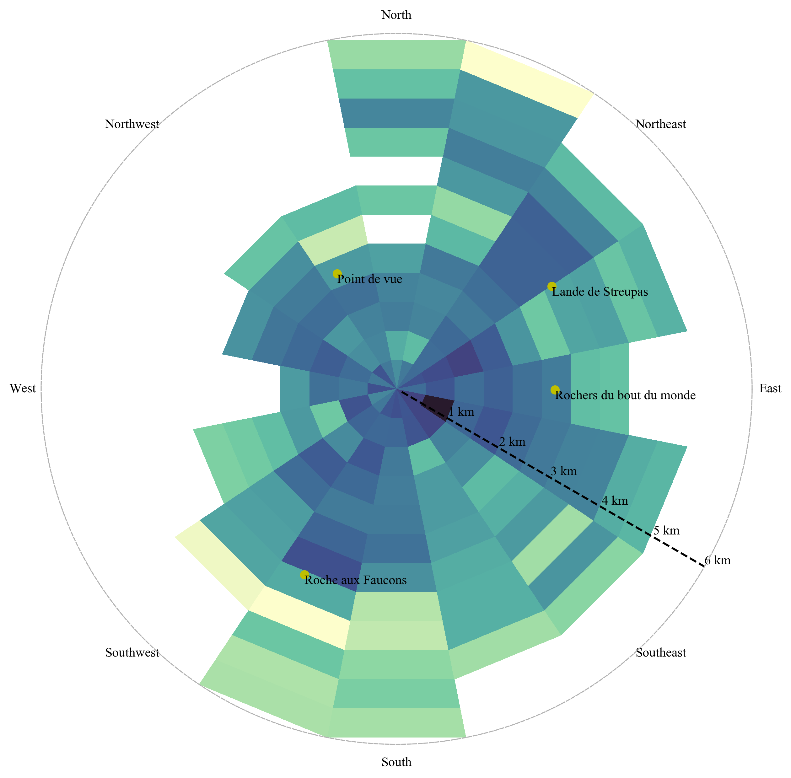
I think it’s a nice starting point for other fancier versions. I like to see that some we’re often running in the same areas, for example the western sector (north of Boncelles) is almost void.
Source code
I’ve put the code into the trail-running repository. In particular the final plot is prepared using GPX2dist_angle_histogram.py.